This project came to me through an outsourcing contract. The client was a company specializing in building maintenance — from preventive work to contractor management.
My task as a designer was to create an interface for two platforms: a web version for managers, admins, and building owners, and a mobile version for technicians and managers.
Goals and my role
We had a small design team on this project, responsible for everything from logic and UX flows to UI design for both web application and native iOS mobile application, and developer handoffs. I worked 70% of the time on the iOS application, and 30% on web app.
The client’s goal was to build a unified platform that would:
track request statuses,
plan and assign maintenance tasks,
manage assets and contractors,
analyze service efficiency.
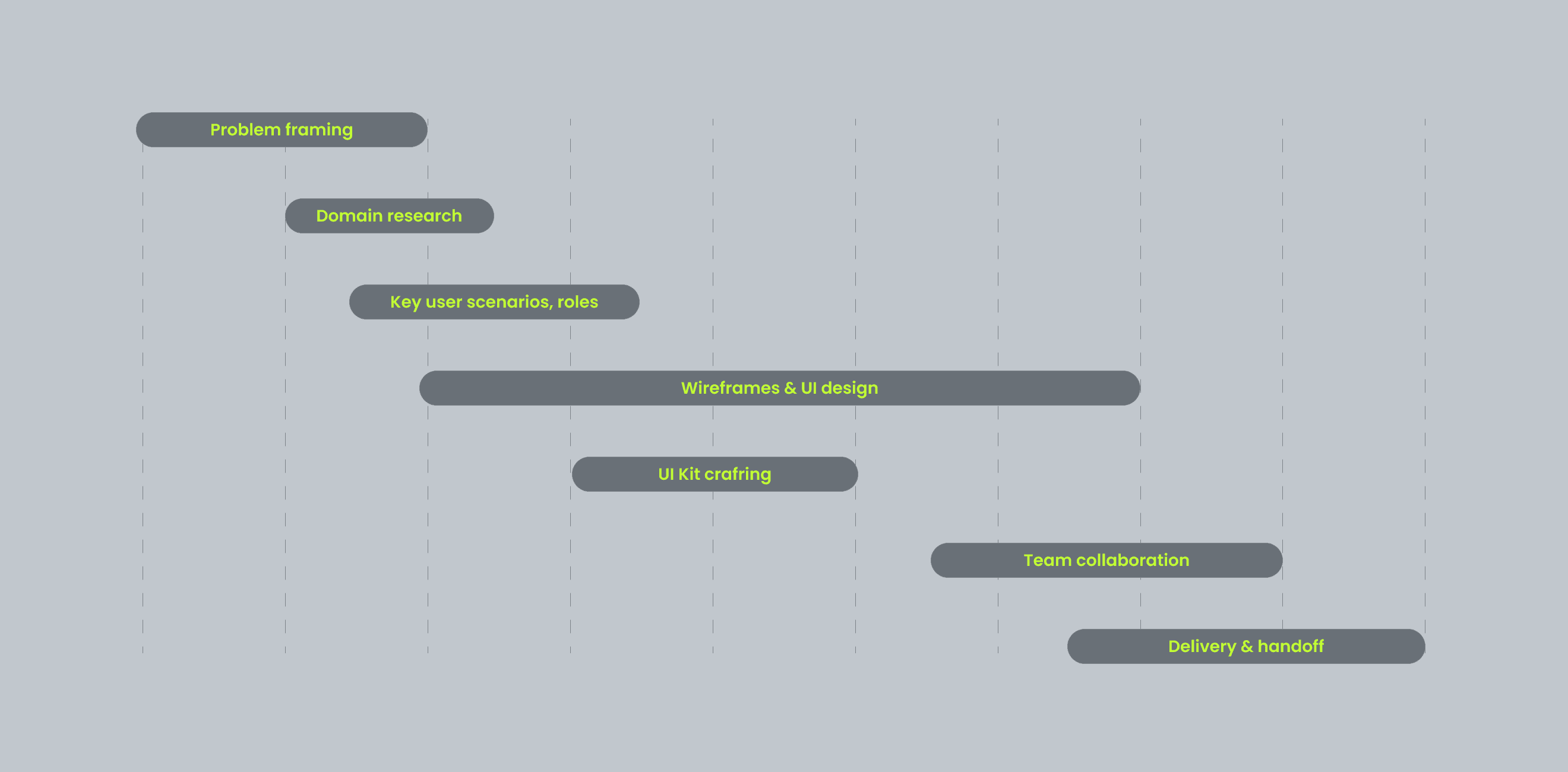
Design process
There was no full discovery phase — I had no access to end-users and no UX research was planned. Still, I had to dive into the domain quickly, define key flows, and design a UI that would help users complete their tasks without overwhelm. That was a real challenge for me, who was not such an experienced designer.
Anyway with PM and stakeholders we've made the process really effective. So I:
studied the domain using public materials and client documentation,
reviewed competitors and interfaces in adjacent domains (field service, asset tracking),
mapped out user roles and their interactions,
defined assumed user flows for each role,
outlined constraints: high data density, role-specific logic, offline scenarios for mobile.
Challenges
During the design, I faced several key challenges:
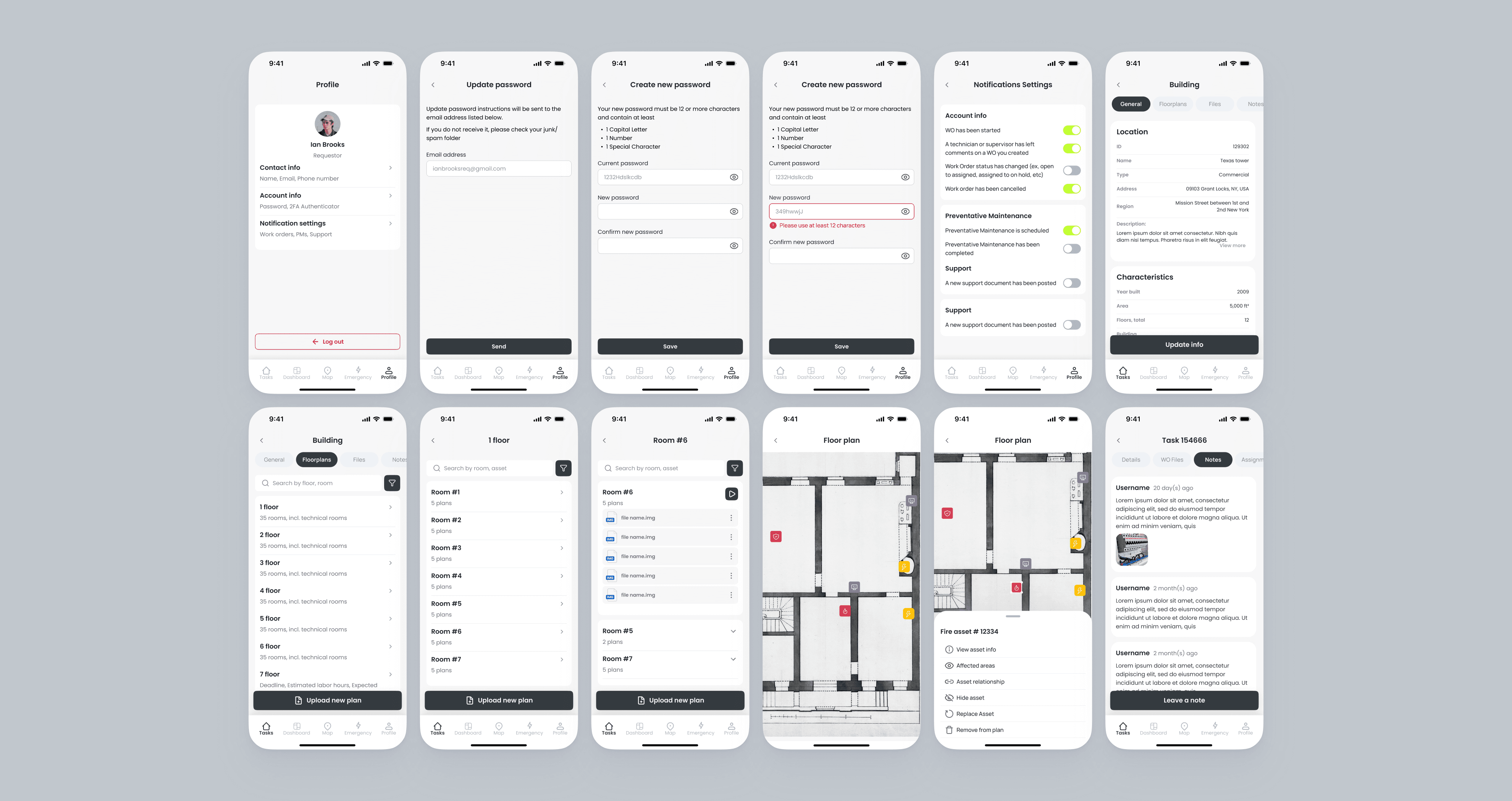
Complex Data Visualization. Screens had to display work orders, asset details, timelines, documents without overwhelming the user
Role-based logic. The desktop version was used by admins and managers, while mobile was designed specifically for technicians, and their managers
Action-first experience. Users needed not just to read data but act on it: update a status, leave a comment, attach photos, and files
Offline access. Since mobile use happened in basements or buildings with poor signal, local data handling was a must
Hypotheses
Based on this, I formulated some hypotheses:
If we limit the mobile interface to essential actions and remove secondary info, task completion time will decrease
If the home screen only shows active requests, it will reduce cognitive load
If users can update statuses and add attachments directly from the card, data accuracy will improve.
If we minimize nesting and hide secondary sections, the app will feel faster and more usable
Looking back, I now see ways to improve the process. I would have validated the hypothesis through an interactive prototype and a short usability test — asking users to complete a task and observing how quickly they get started
Key Scenarios
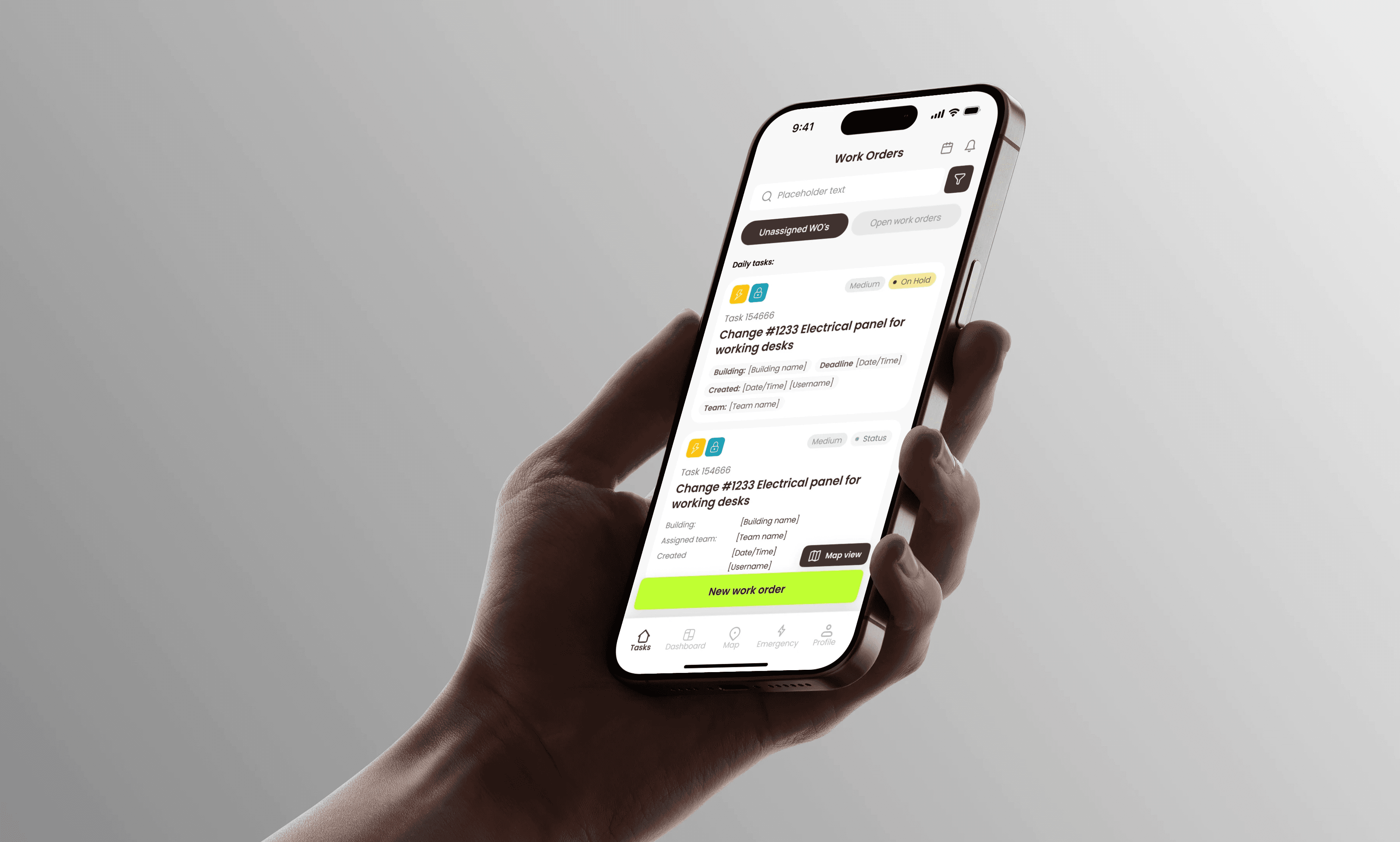
For the mobile app, I focused on core flows for technicians:
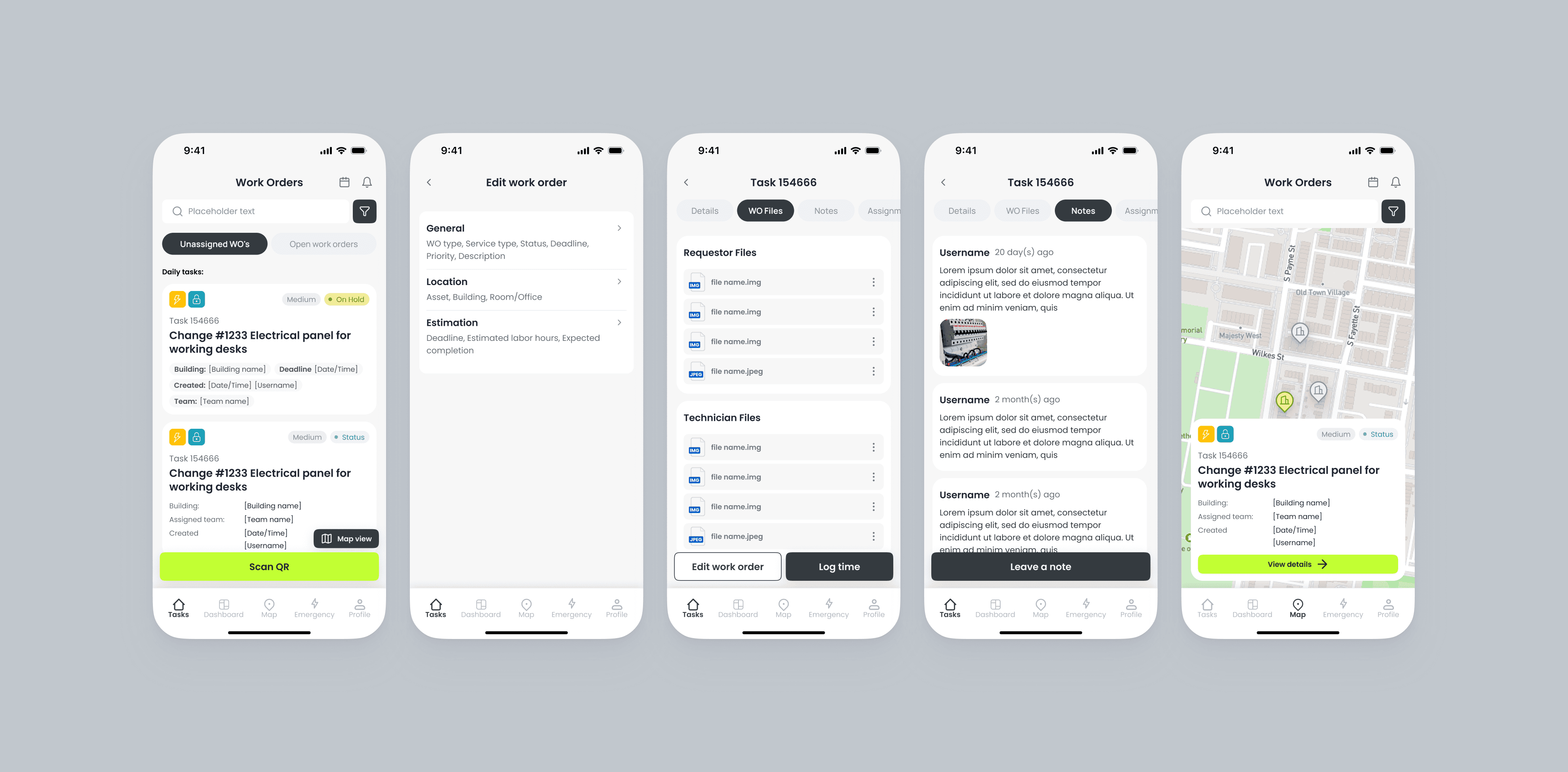
List of work orders
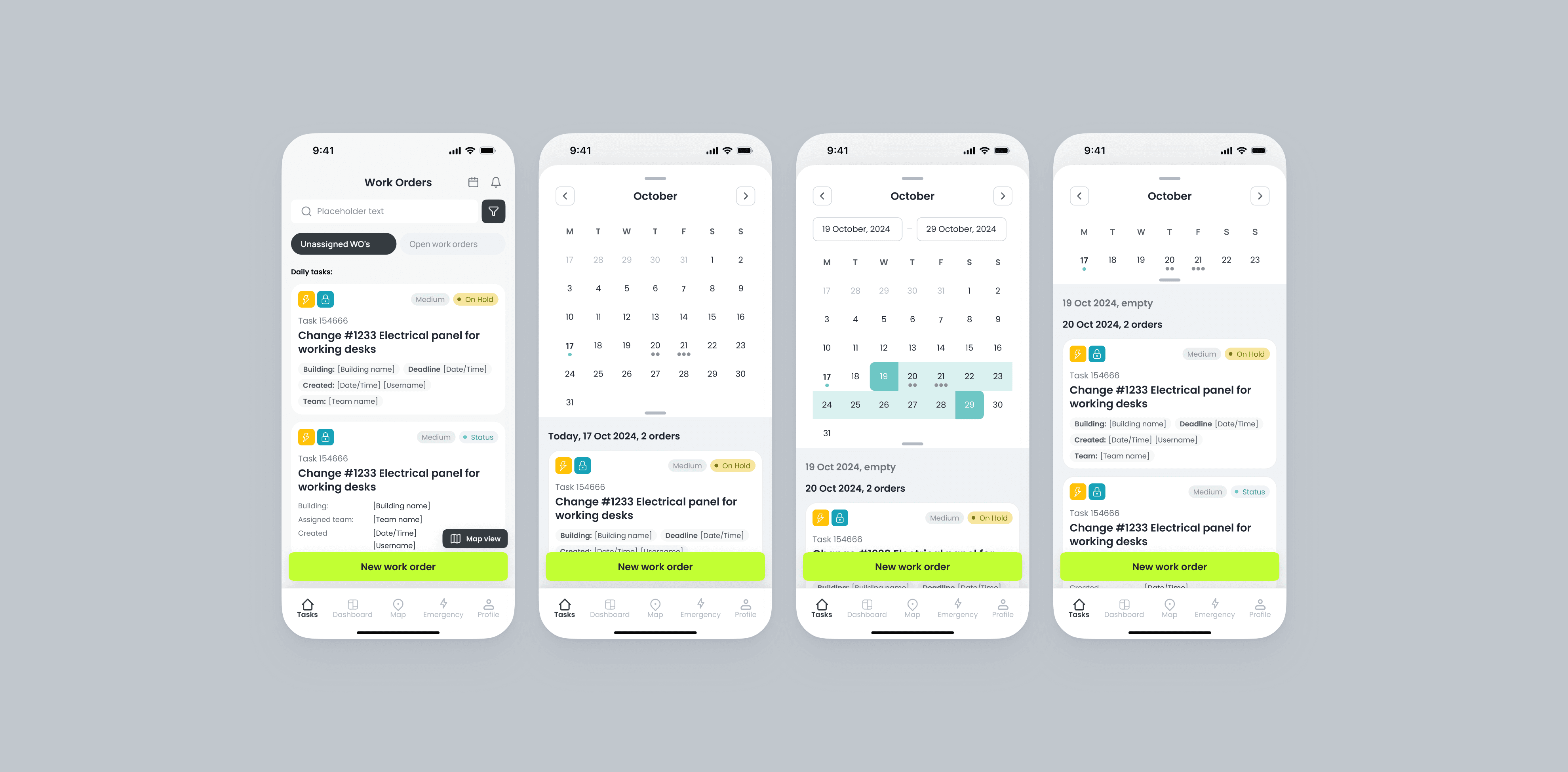
Calendar with assigned ordes
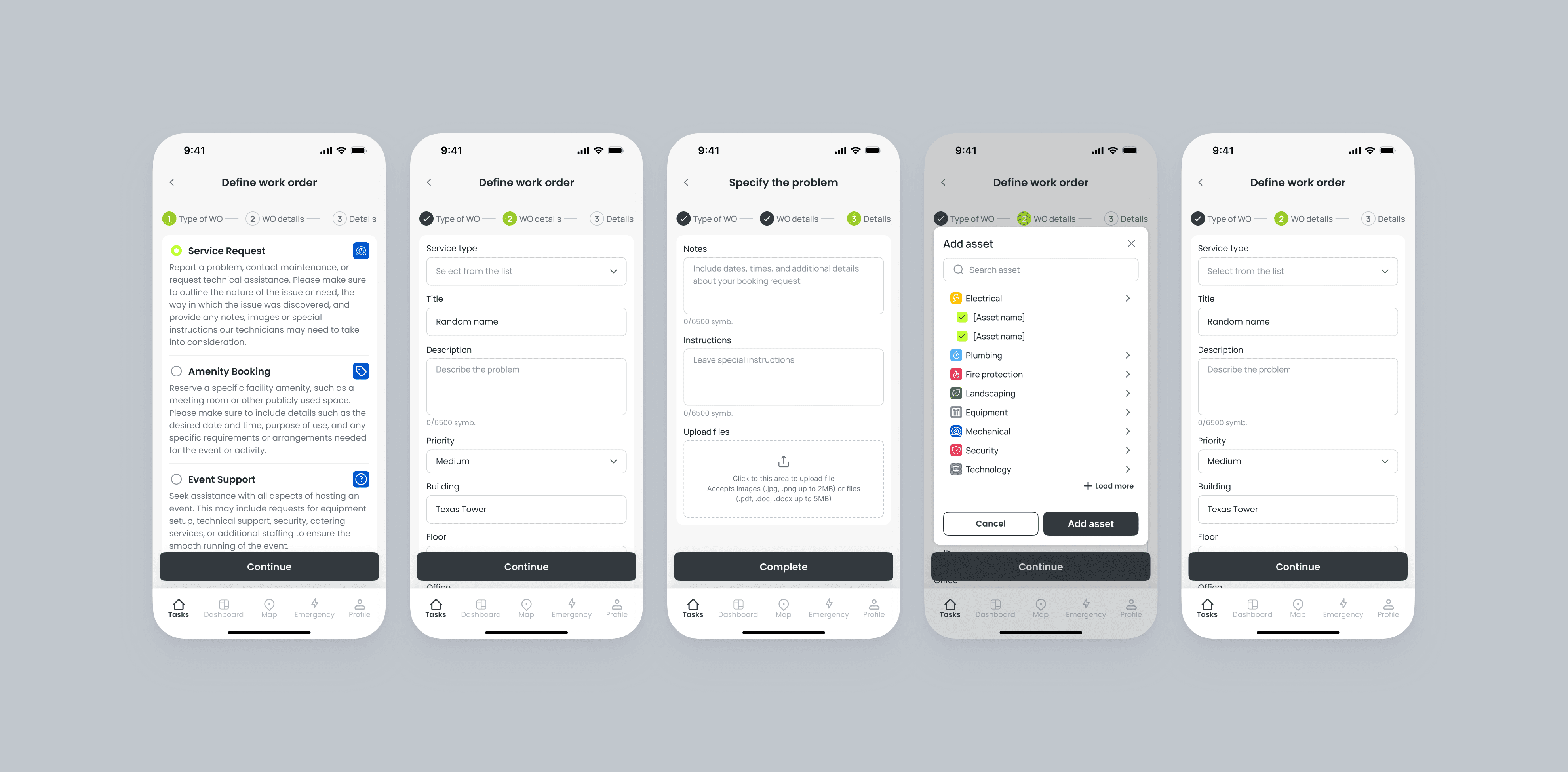
Creating new orders
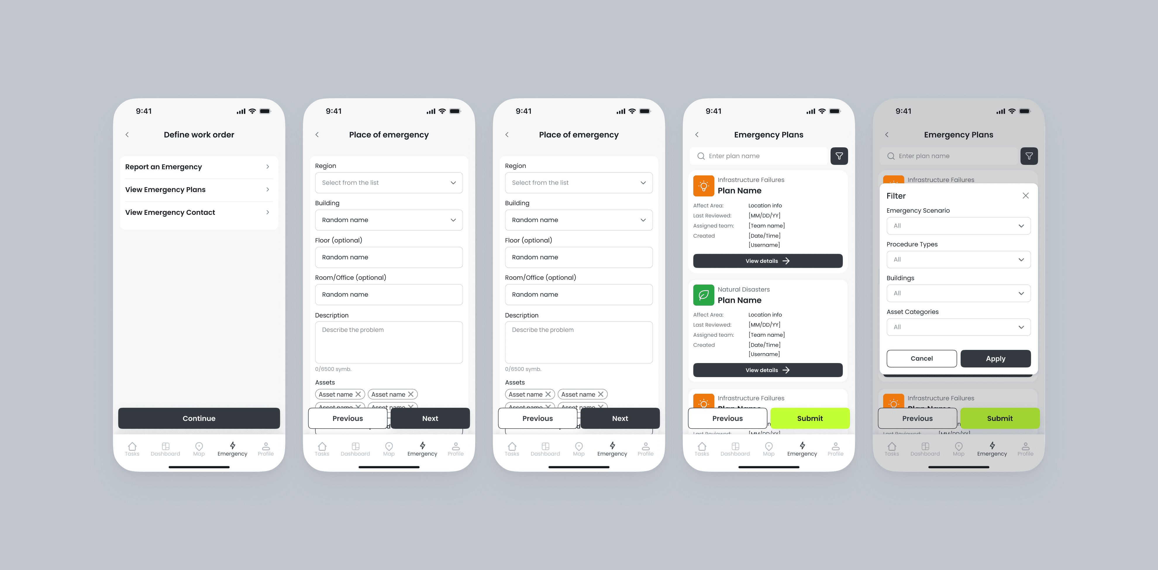
Creating emergency work orders
and other…
For the web app, scenarios were more complex and included:
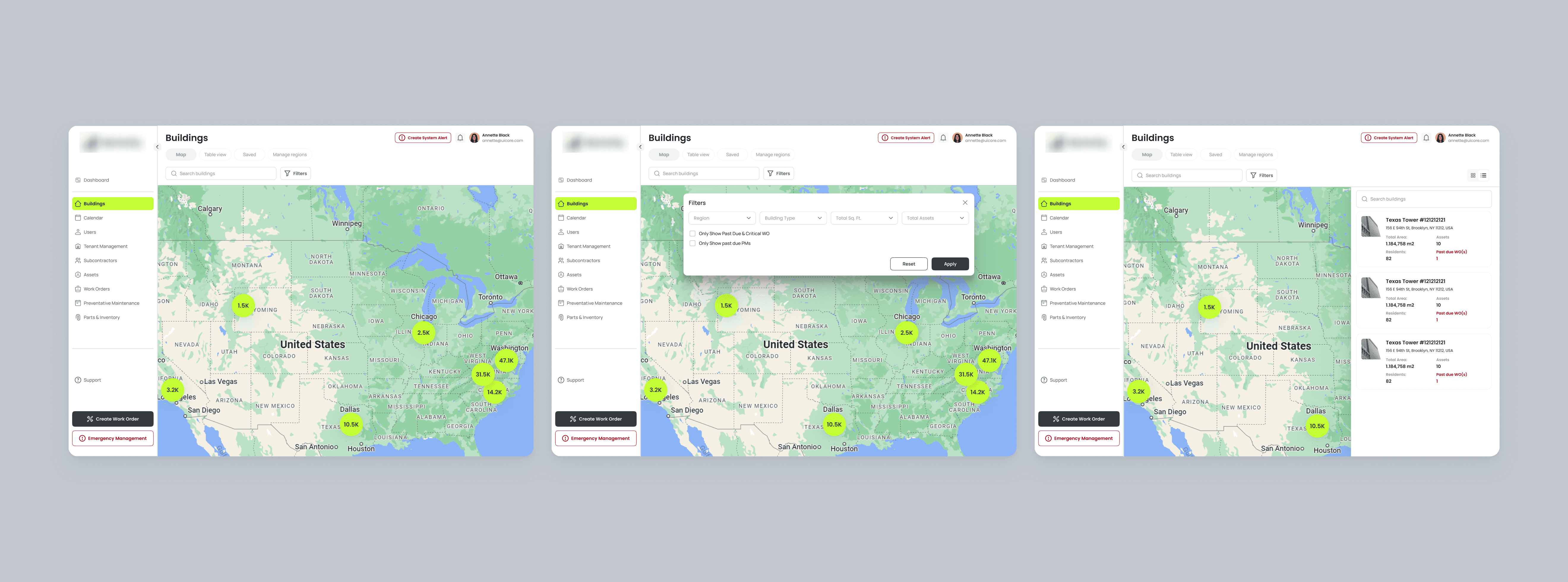
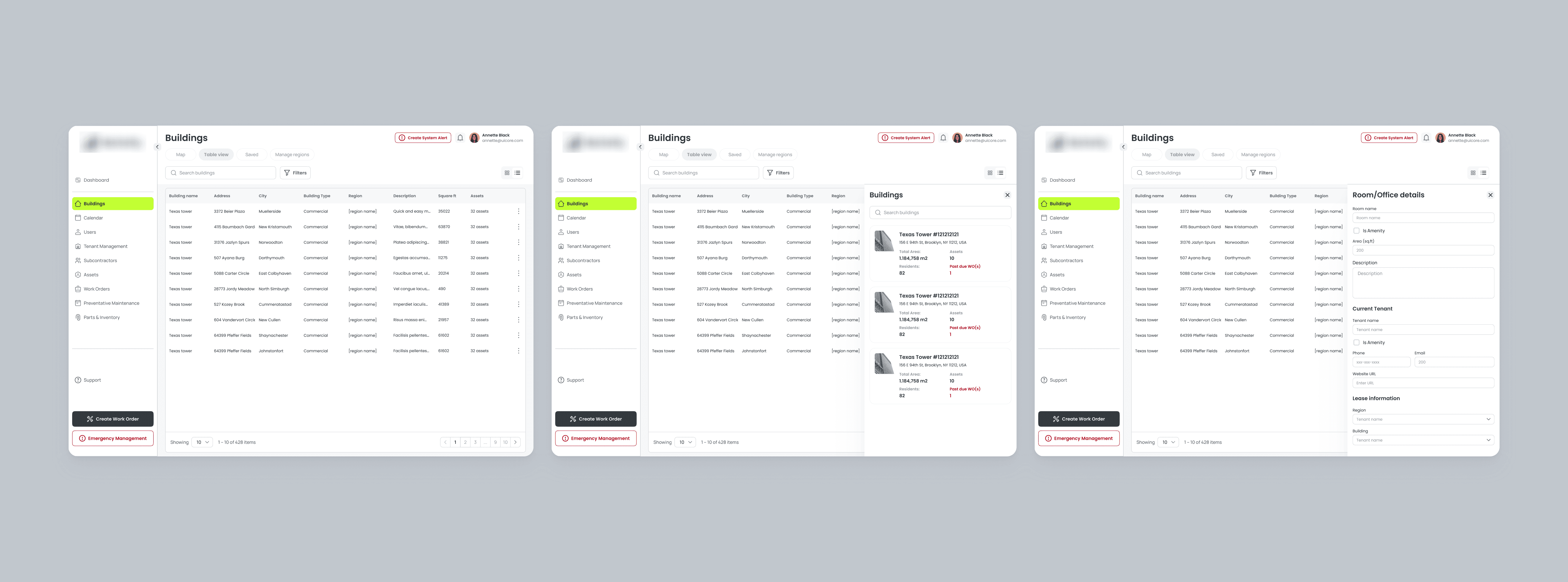
Management across multiple buildings
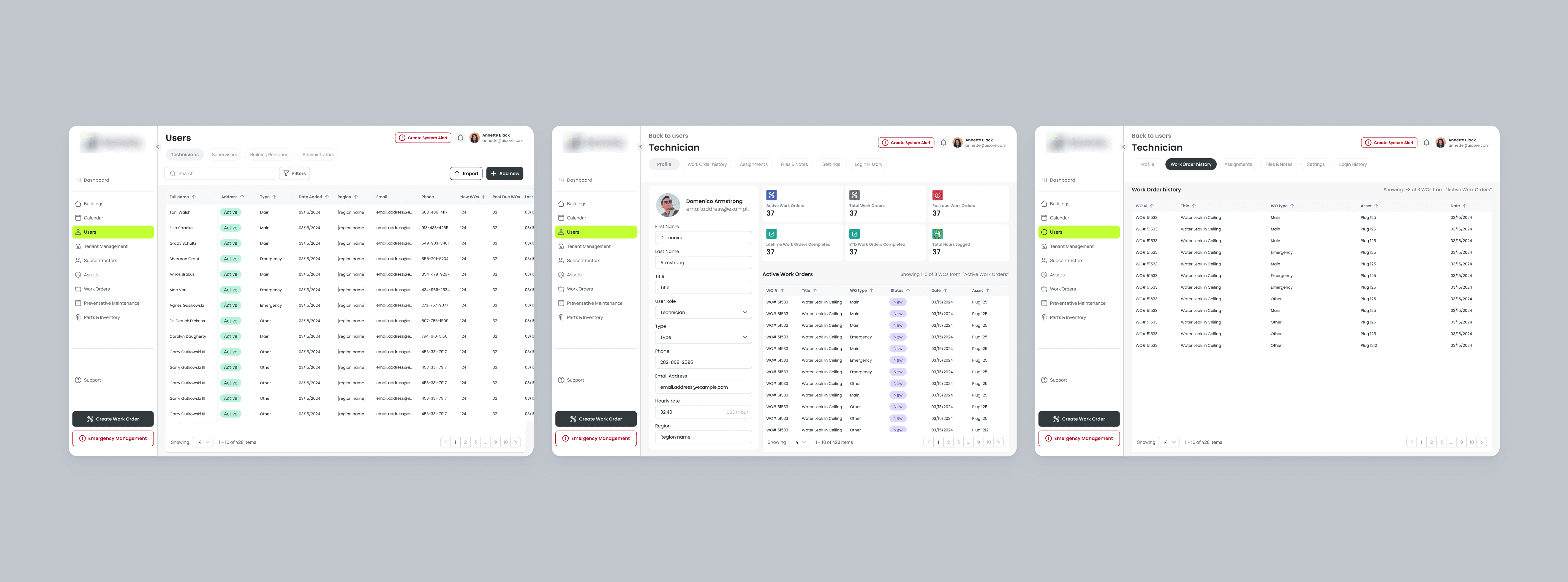
Users and access management
Results
The project was handed off to development.
Based on internal testing, the client noted a clean and intuitive interface, fast navigation even in dense data views, ease of use for technicians on mobile.
This project gave me valuable experience working with complex interfaces and multi-role logic.