Style Settings Redesign —
Admin Panel for Restaurant Software
Improving visual consistency of admin panel which manages 12K+ devices — redesigning style settings for better branding control
Context
The company, which is engaged in the automation of restaurant services. The company itself has 12K+ devices worldwide, which are managed from a single admin panel (AMS)
The product is an admin panel for managing restaurant soft&hardware, which is used by B2B clients (managers of restaurants, coffee shops), as well as employees of the company itself.
Background
My role
As the only designer in the company, I led UX & UI concept under constraints: no analytics, no direct user access. I deeply studied all problems our customers deal with, and conducted short surveys, collected feedback, studied repeated requests.
Problem
Product needed a more intuitive and scalable way to manage customers branding.
Cluttered interface caused friction and support overload. Business needed a vision for scalable redesign.
Goals
Simplify interaction with the module for both current customers and onboarding for new ones
Minimize the number of calls to technical support for this module
Improve the UX and visual style
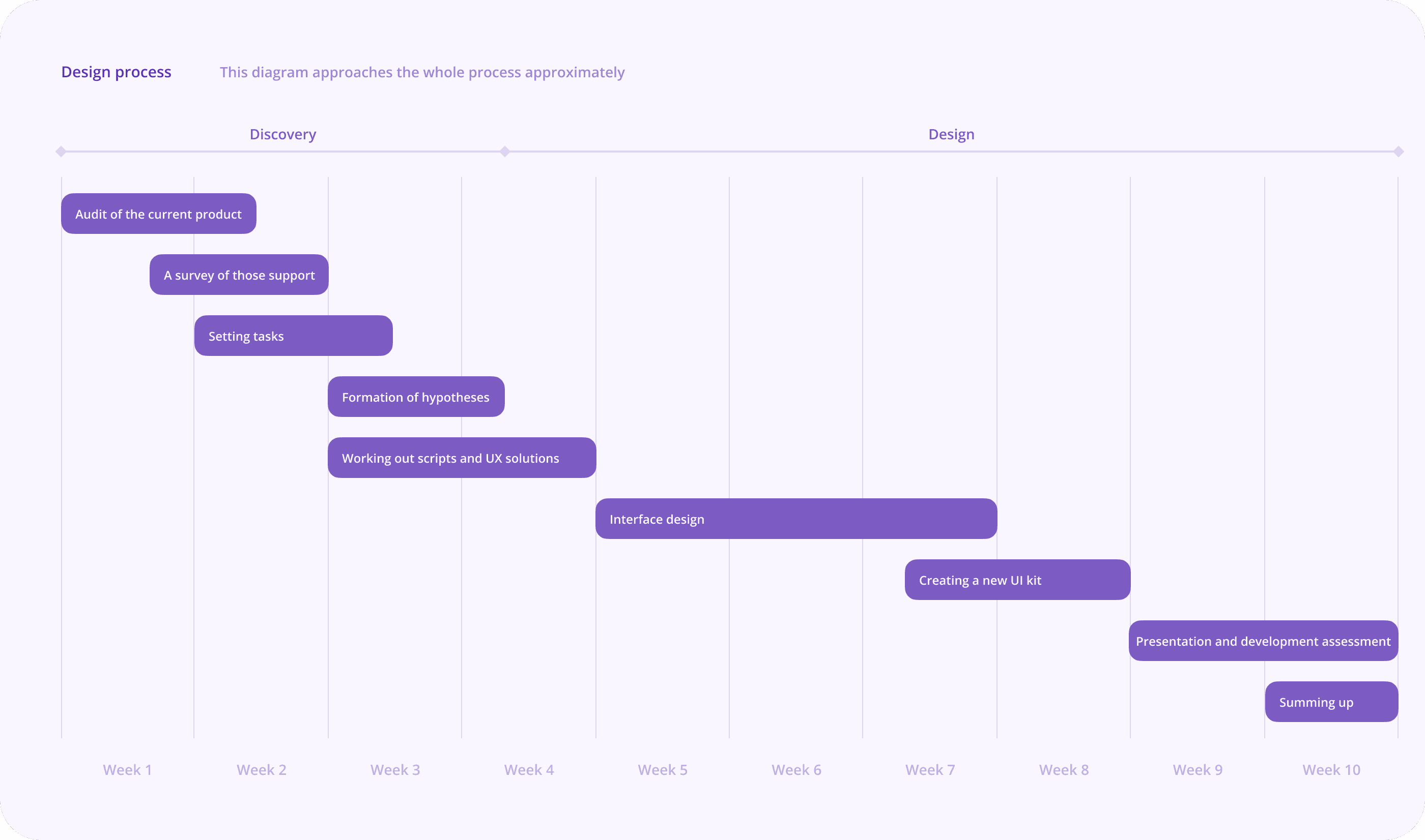
Research and analysis
I studied user interaction with the module in the context of launching and working with locations. Moreover I decided to conduct surveys among support team who works in this module or receive inquiries on this topic
User surveys
The primary goal of my user servey was to gain a deeper understanding of the key problems and challenges faced by customers who work on a daily basis with the product and pain points for upcoming customers
The problems that came up over and over again were quite specific
👩🏻💼 I need to upload the same content for both devices (there are 100+ images)
🧑🏼💼 I don't understand how the image is uploaded, why it is cropped
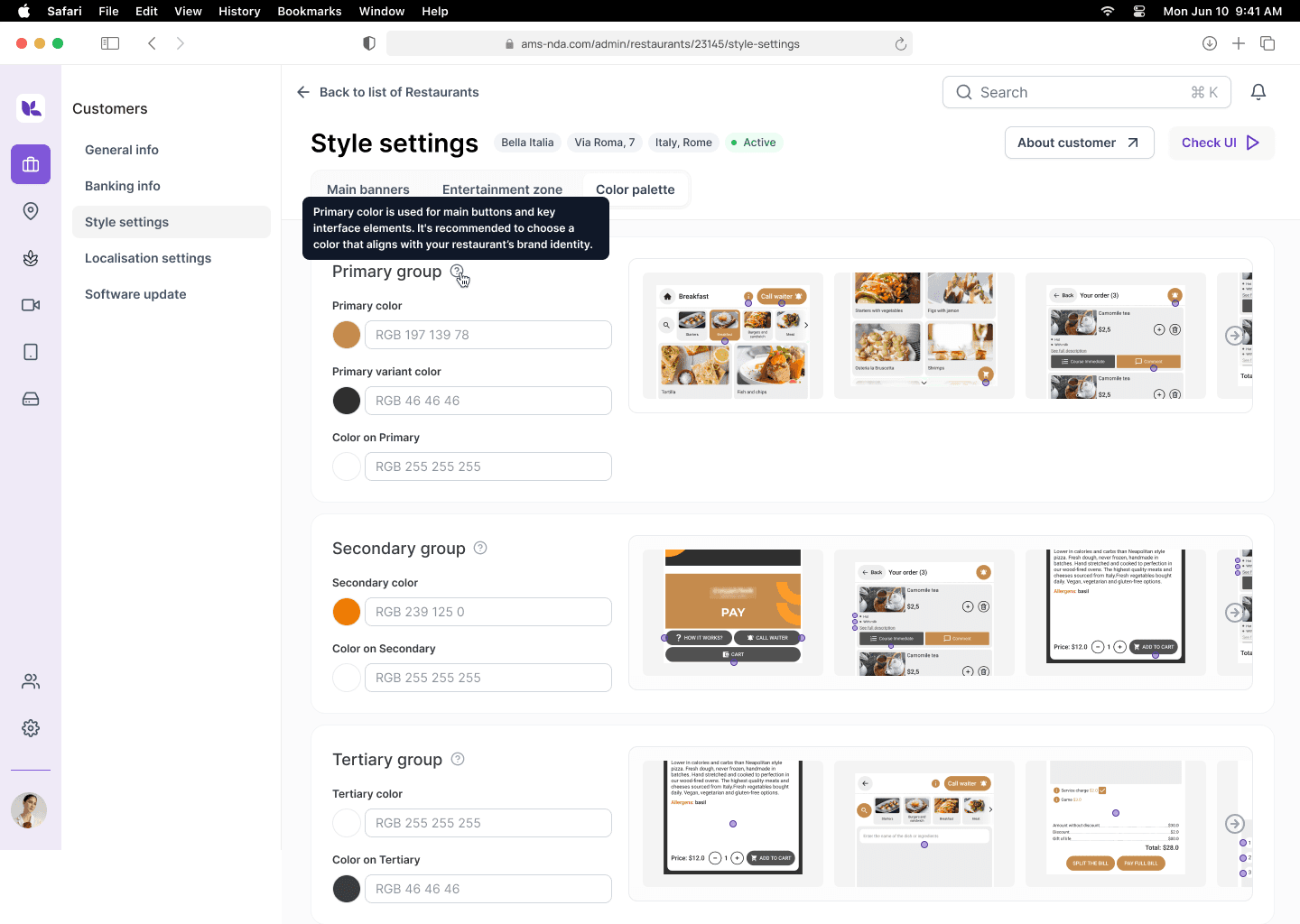
🧑🏻💻 What does "Primary color" mean?
👨🏼💻 How can I crop the images correctly?
👩🏻💻 Difficult to track which styles are applied to which zone
The insights I gained through surveys and information from products helped me formulate the main hypotheses.
Hypotheses
If you group palettes and media content separately, it will reduce the overload on the screen and make the system more scalable. Now the interface is overloaded, all the settings go all over the page, users are poorly oriented.
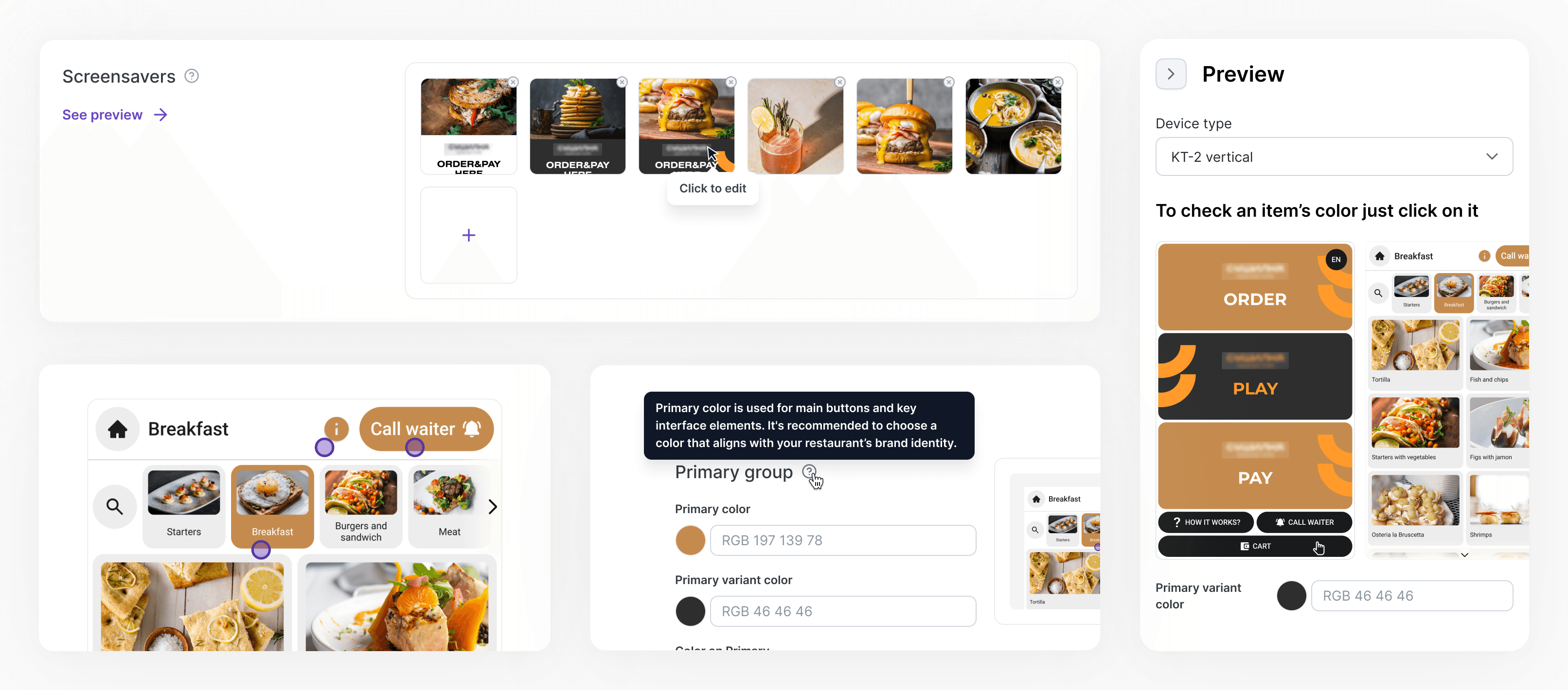
If the user can reuse styles (palettes) and media content, it will speed up the work with the module in repetitive scenarios.
If users are given the opportunity to preview the style settings, they can make adjustments themselves immediately, which will reduce the burden on technical support.
Pain
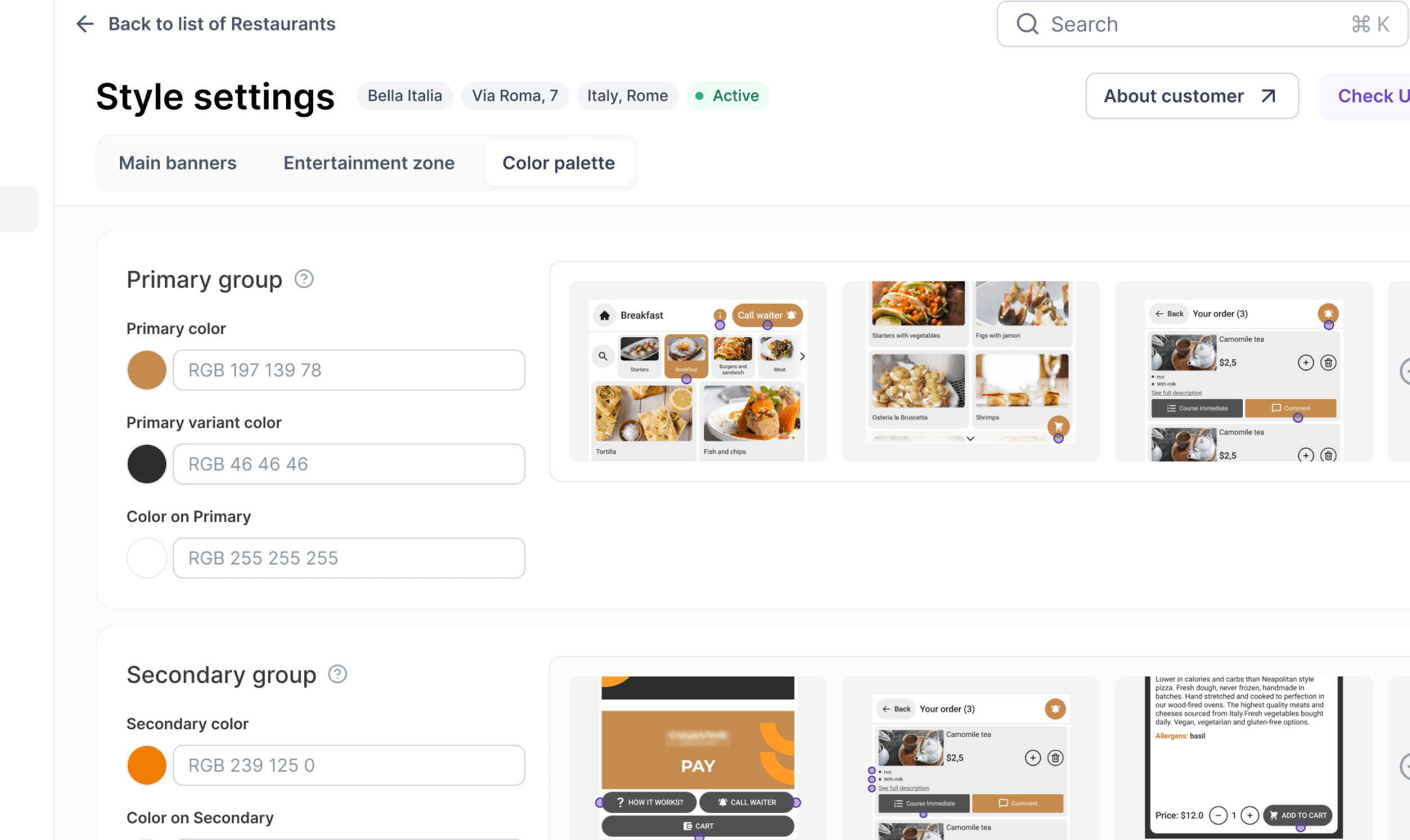
All style settings are on one page, so users get lost
Insight
Split media content & palette settings
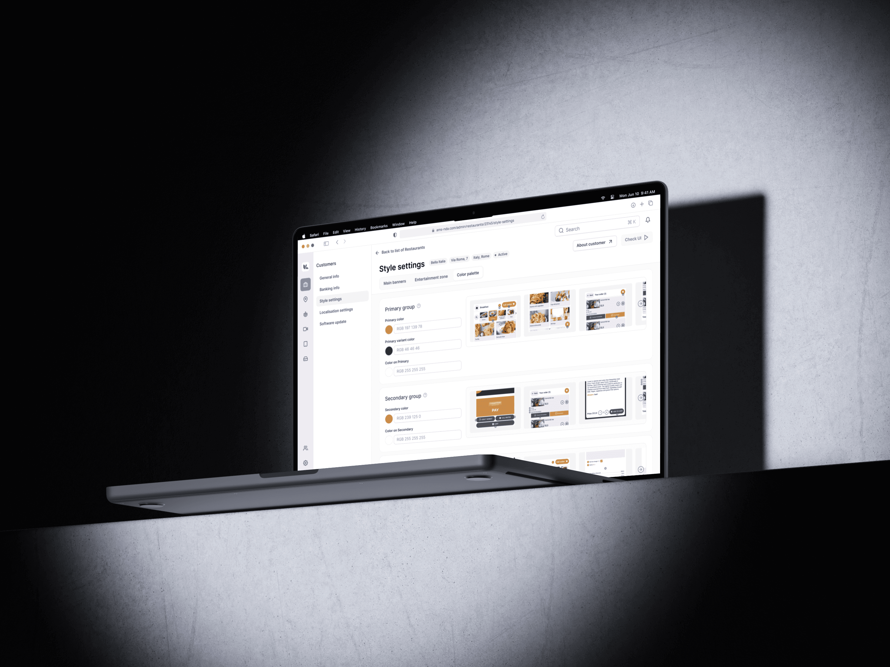
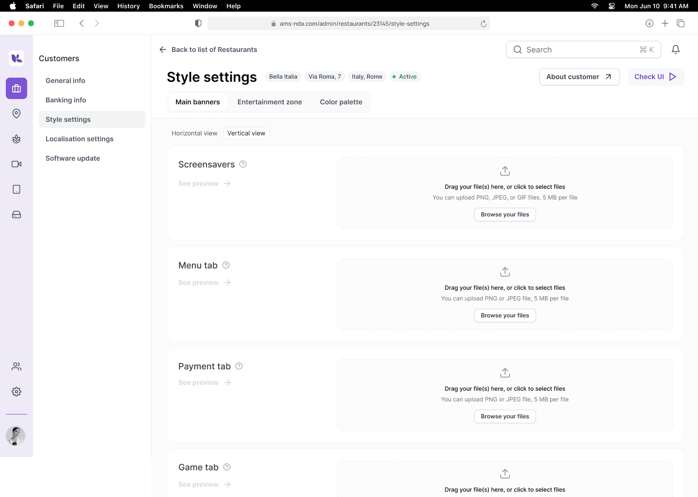
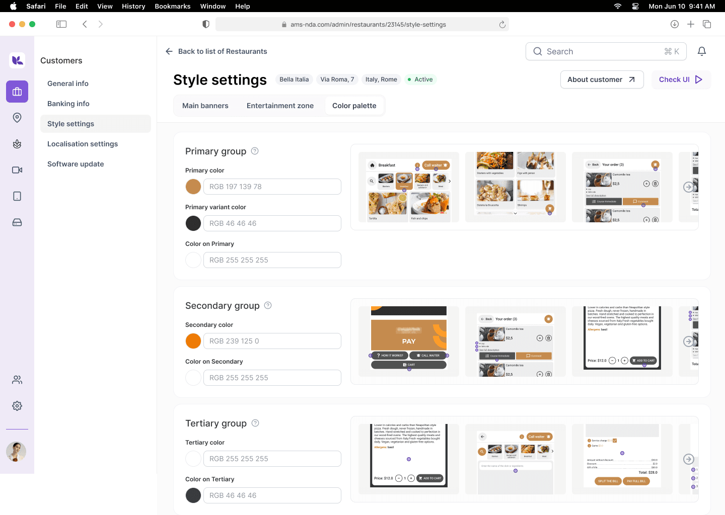
Solution
New tab structure for clarity
More than a concept
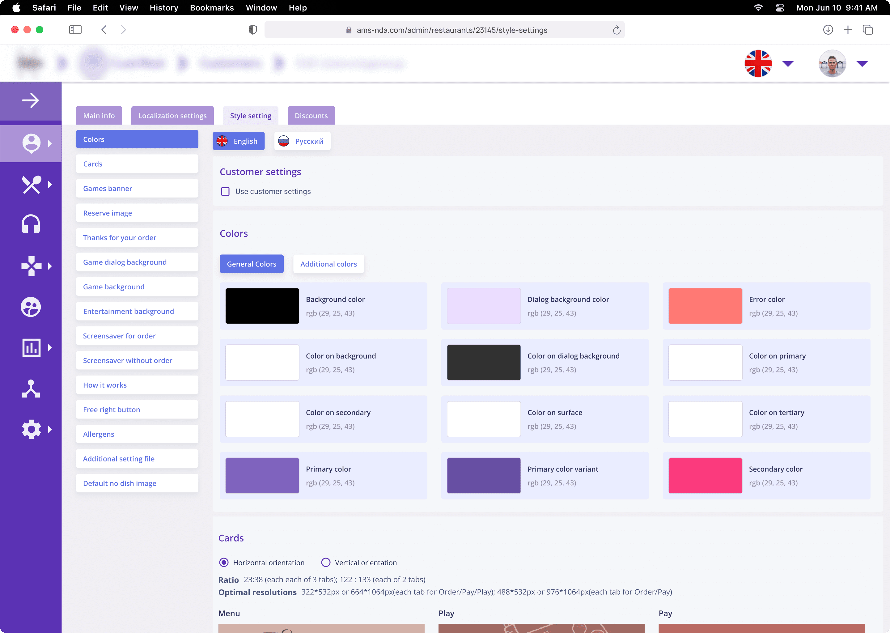
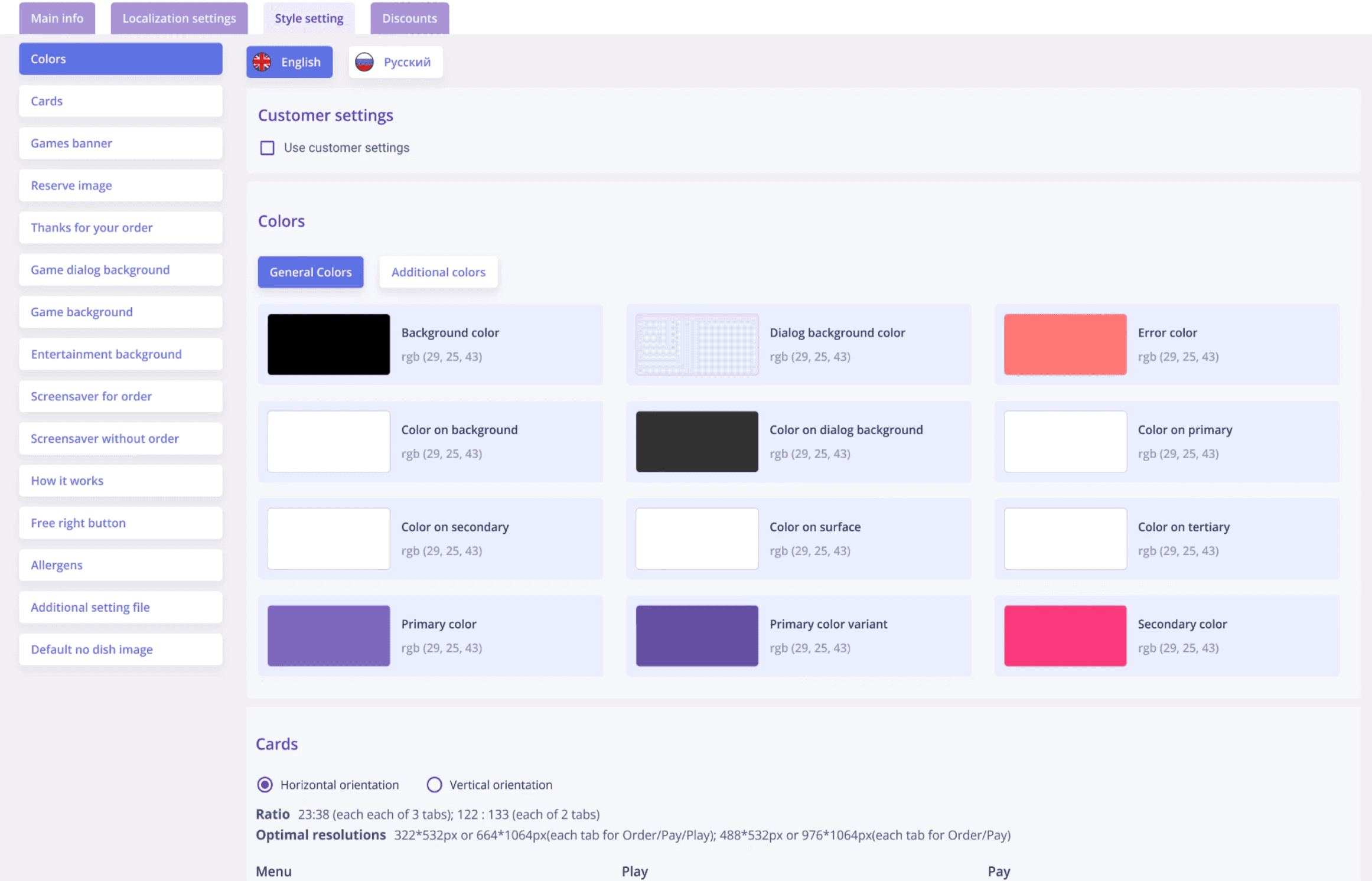
Before: one chaotic screen
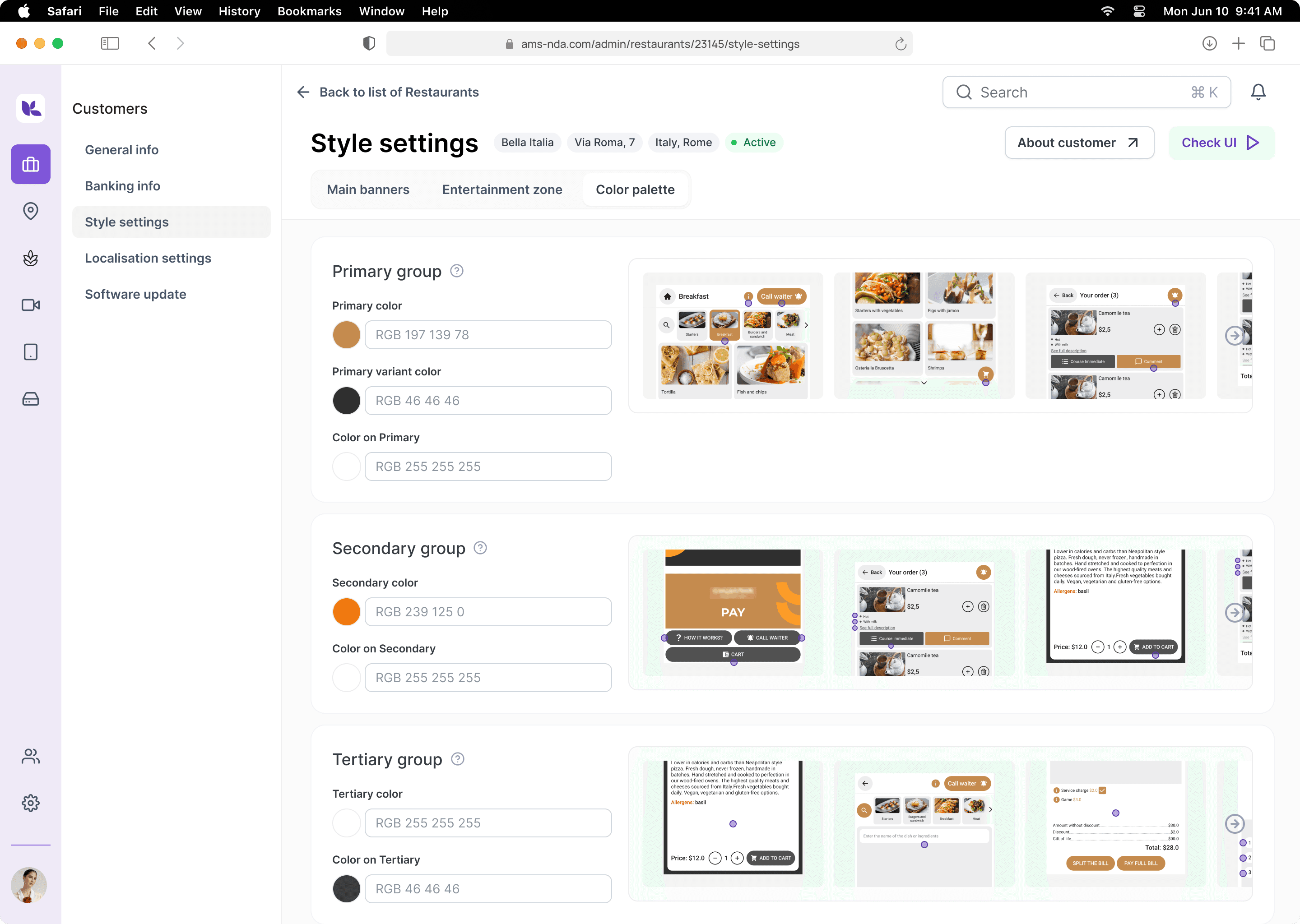
After: modular system with reusable assets
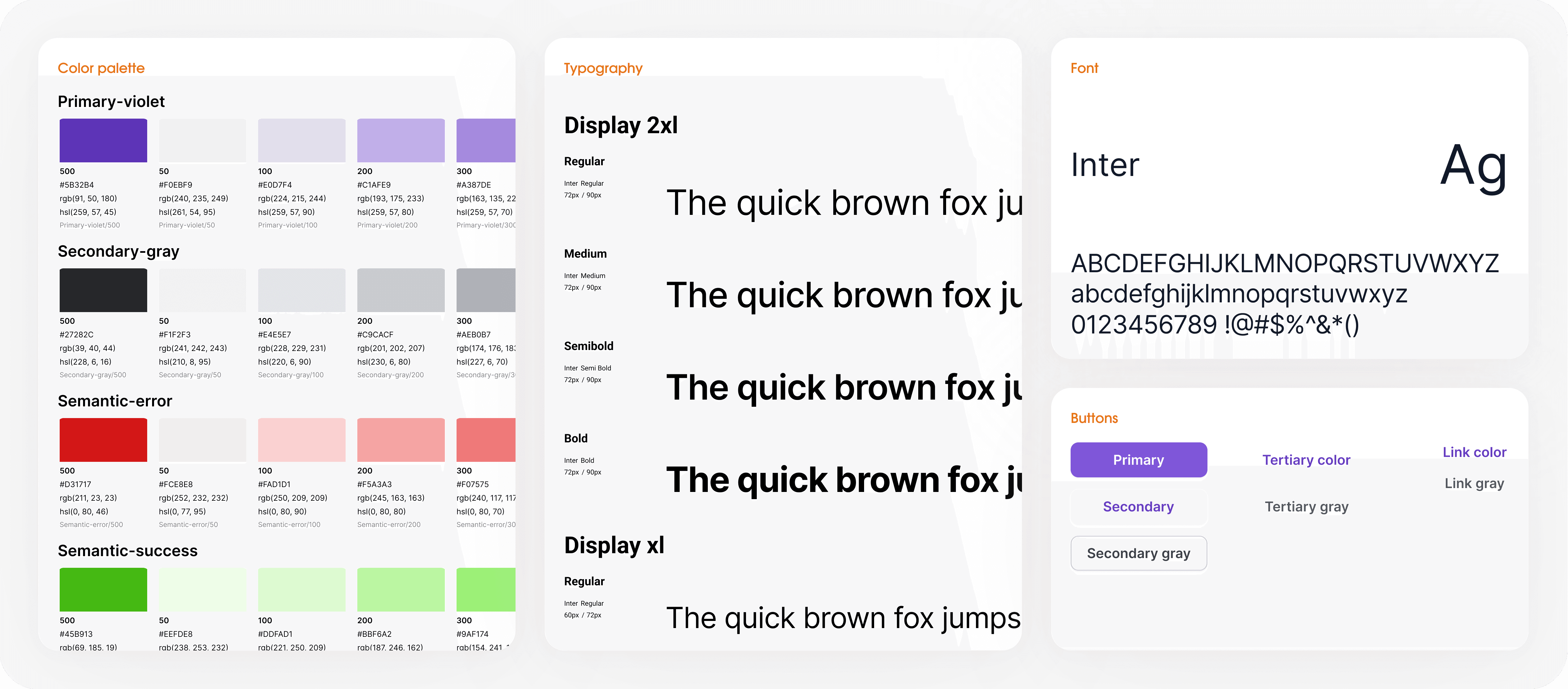
New visual style
Principles
1
modern, light, neutral UI
2
accents on key elements and core features
3
minimum visual noise, maximum benefit
Results
The concept was also conceived as a tool for attracting partners and investors — on the one hand, demonstrating the potential for product development, on the other — relying on an already working, albeit outdated, version on the market.