Design for the service which helps flight agents to generate flight options based on GDS code faster in comparison with manual generating
Context
The service helped flight agents convert raw GDS data into commercial offers for clients booking business-class tickets. Customers might get 2-3 offers per week, so the process should be really fast.
The MVP interface was barely working: agents copied data manually, couldn’t preview what they were sending, and often made mistakes.
Stakeholders’ main concern
The process was too slow, and created confusion for clients with different prices.
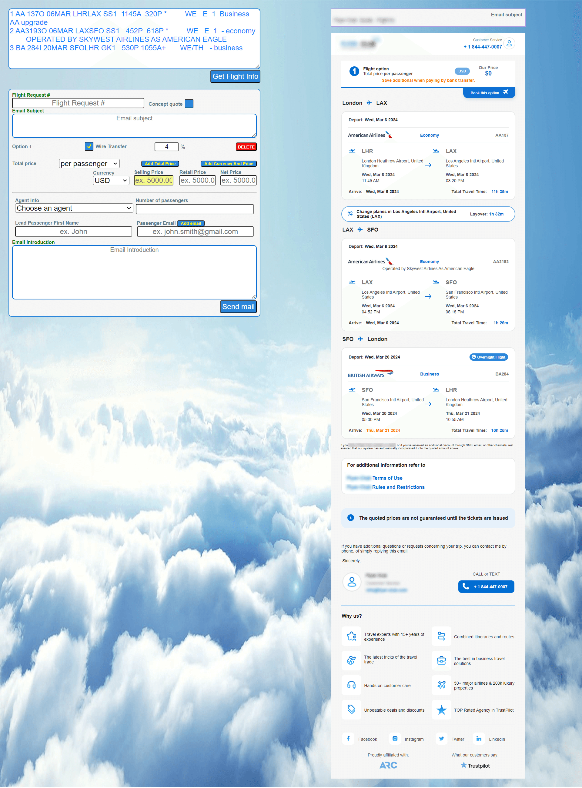
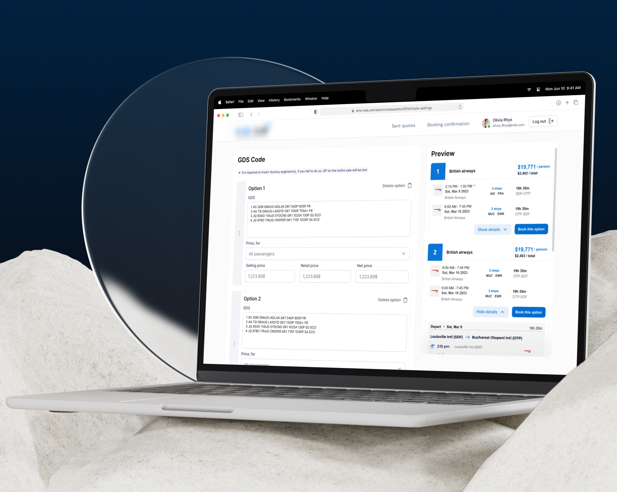
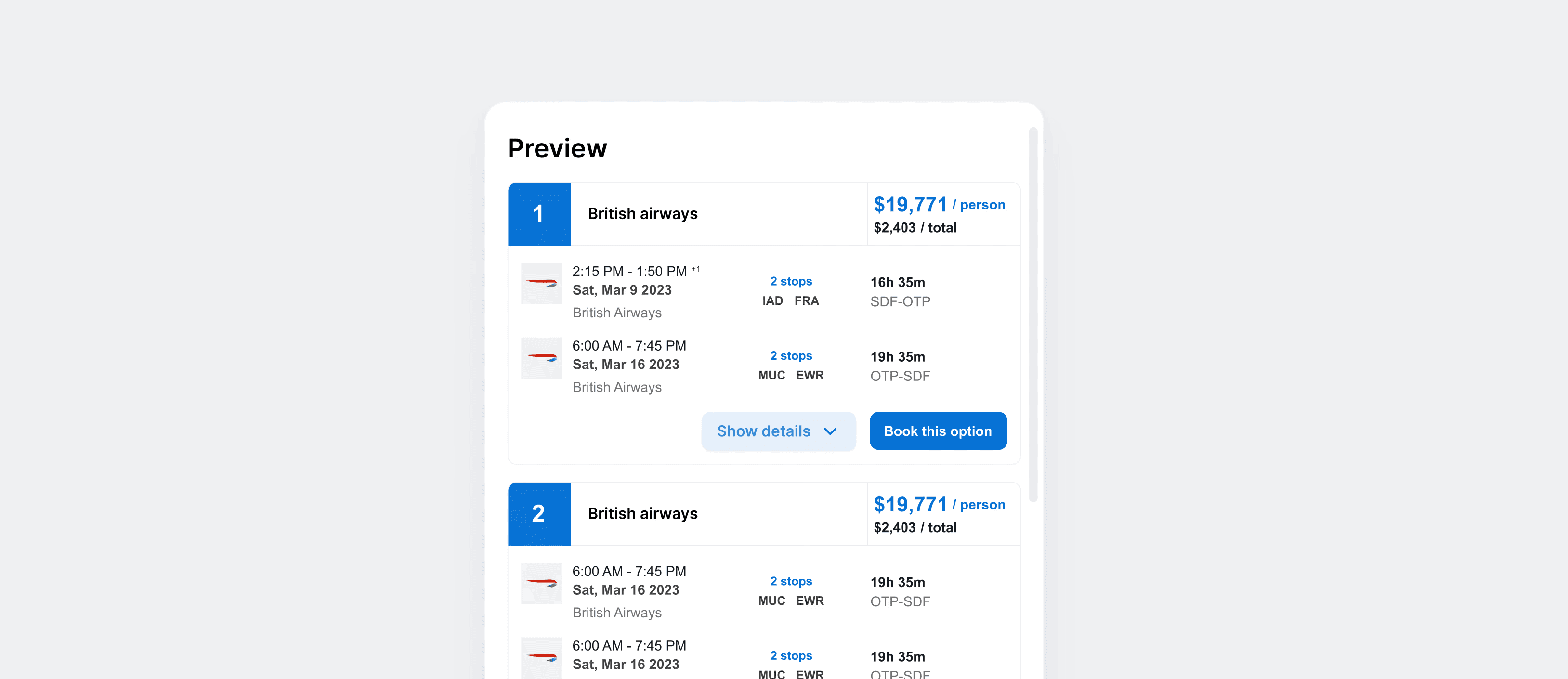
That’s how draft functionality looked like
Problems and business value
MVP already existed, but it was implemented badly from user’s perspective — the interface displayed raw data, without previews, logic and visual order and consistency.
The service also helped the startup to scale faster and, most importantly, to maintain a stable level of agent work without training and mistakes.
User’s pain points
Agents don’t know what data is required to fulfil
No logic and hints in the system
Send outdated or incomplete offers
Making mistakes in the flight options while filling out
Agents don't understand what the offer looks like in the end
With a lack of data and interviews with agents, we started discovery with the MVP and feedback from the stakeholders. We knew that agents got lost, and had no preview of the offer they they're sending to the client
I started by analyzing the current interface and the entire process: from requests to sending an email offer to the customers.
Approach
Main hypotheses were formulated after communication with Dev team lead, and on the feedback from our stakeholders. I studied the data gained from GDS-code*, and we defined which data agents really needed.
This helped us to keep in the interface only that specific info which varies from customer to customer with no need to fulfil flight info.

Visual concept
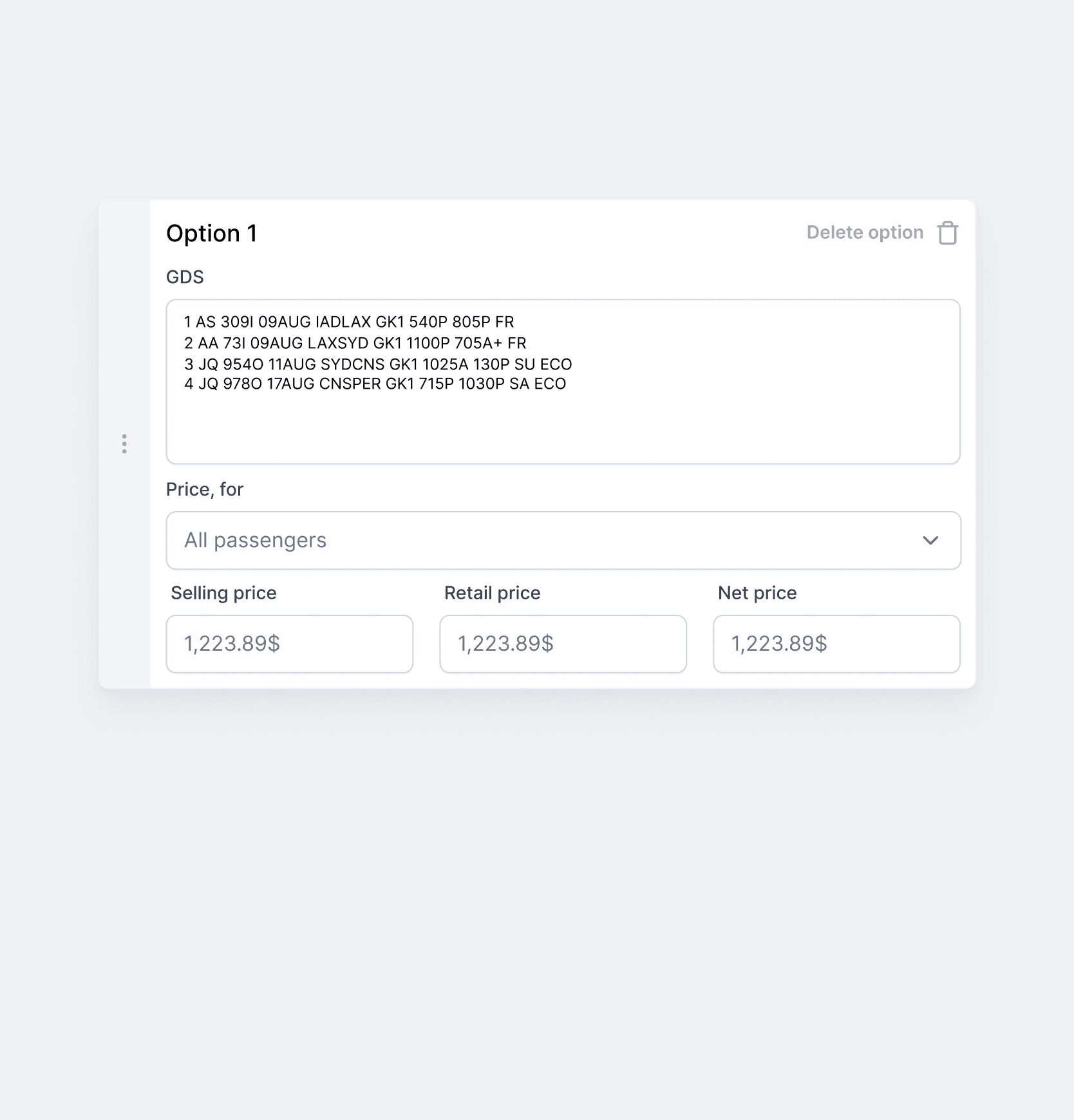
The focus was an interface in a clean style to reduce noise and keep agent’s attention on the flight options.
I used flashcards, explicit captions, and visual groups, added preview side and made last check-ups required for agents. This helped agents easily navigate in the system, and speed up work.
Results
This case helped the business evaluate design thinking approach, and helped to achieve results quickly with lack of data and time. They’ve noted that the interface became more predictable and clean, agents made fewer mistakes and could check the appearance of the offer.
With team cooperation, and careful analysis, the decision came up with potential to become a unique CRM system.