How I made a 24-combination pricing model feel like a simple choice for a Saas product
A subscription system for an indie-artist platform. Two sides, two different jobs: the artist builds the tiers, the fan picks a plan. I had to untangle the pricing so neither side drowns in it

What I did on the project
Product designer, full ownership
→ All flows and states of the subscription system
→ Paywall and content-access fork
→ Review of comparable products (Patreon, Boosty, streaming)
→ Design system components, web → mobile
→ Direct communication with the client
Problem
An artist can create up to 6 tiers, each with 4 billing periods and its own discount. Shown flat, that's 24 price combinations — and both sides get lost
The artist and the fan have different jobs. The artist needs to build tiers without getting confused. The fan needs to pick a plan without feeling overwhelmed. One layout can't serve both — the matrix had to be split by context
Where I started
Looked at how other subscription platforms solve this
Before designing the paywall, I went through how Patreon, Boosty and streaming apps handle plan selection.
I didn't build a formal comparison table — I looked at specific patterns: how they show multiple billing periods, how they highlight the value of a longer plan, how they separate free from paid
What I took ✅
They pull the billing-period switch out as a separate control at the top and mark the discount for longer plans right on it. That way you don't need a separate card for every combination
What I skipped ❌
The feature-comparison tables streaming apps use. Here, the artist sets content access themselves in a separate manage-access module — a tier is about access level, not a list of features.

Artist side · Creating tiers
Split viewing tiers from creating one
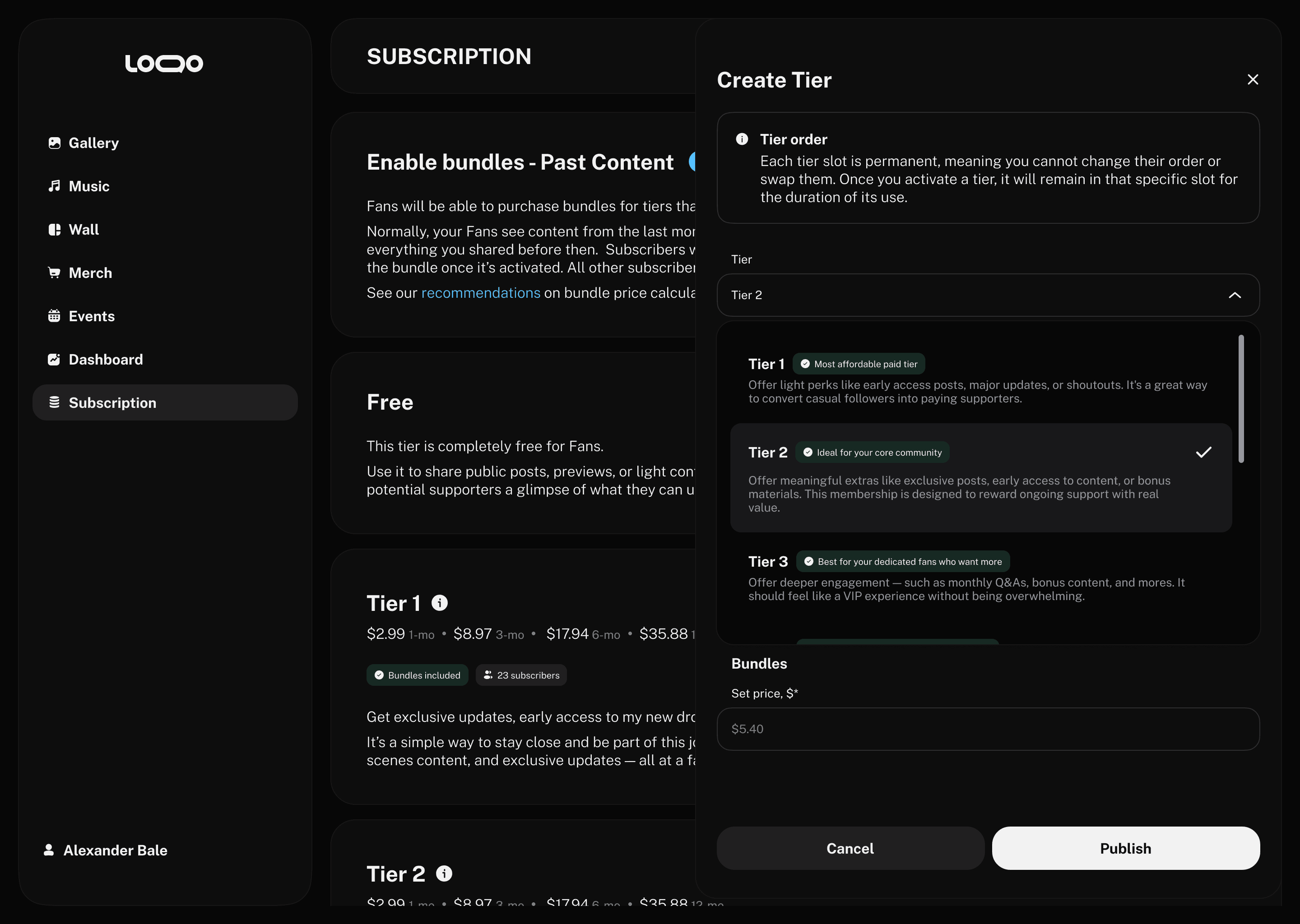
The tier list and the create-a-tier flow are two different things at the architecture level, so I separated them from the start instead of cramming both into one screen. The list shows every tier with prices across the four periods, a subscriber count and status. Creating a tier is its own flow.
Tier list. Four billing periods read in a single row; status and subscribers sit on the card. The artist sees their whole monetization at a glance, without opening each tier.

Prevention by design. Instead of catching duplicates after the fact, the system makes them impossible: the artist must pick a tier level, and levels already in use aren't offered. There's no way to end up with two identical tiers. The flow guides the setup step by step rather than leaving the artist alone with the matrix.
Fan side · Picking a plan
Billing period as one switch, tiers as a grid
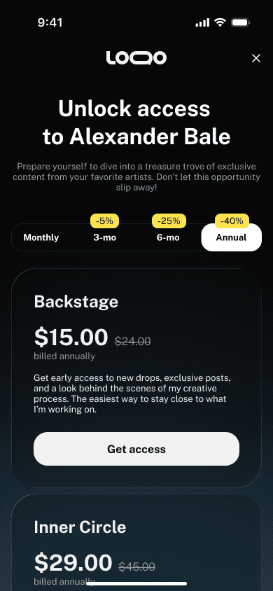
This is where what I'd seen in Patreon and streaming apps paid off. Instead of 24 separate cards, I pulled the billing period (1 / 3 / 6 / 12 months) up top as a single switch with discounts, and kept the tiers as cards in a grid. The fan picks a horizon first, then compares tiers within one pricing context
Paywall. 24 combinations collapse into 6 cards plus a period choice. The value of a longer plan sits on the switch, and tier states (active / available / cancel) read at a glance

Flexible access. For a single piece of content, a fork: buy it once or upgrade the tier. The fan picks the path instead of being forced down one — less friction to pay
Design system
Shared components, web → mobile
I built the modules on one design system that carried from web to the mobile app — reusable components and shared rules, so the platform reads as a single product across both sides and both platforms.

What these decisions are built to drive
600+
screens & states delivered
18
User scenarios covered
4 mo
timeline
Flexible access (one-time purchase or upgrade) is designed to lower the barrier to paying and unlock revenue from fans who aren't ready to subscribe yet,
Clear tier setup is meant to help artists finish creating a tier and actually launch monetization instead of dropping off,
Highlighting the value of longer periods is built to nudge choices toward 6–12 month plans.