A two-sided marketplace connecting waste centers and haulers. I designed for an MVP targeting 5+ waste centers and 30+ haulers, processing 250+ loads monthly — with 3 distinct user roles across iOS and Android
750+
screens & states delivered for Hauler's app
26
User scenarios covered
5 mo
timeline, delivered on schedule
2
Platforms (iOS & Android)

Overview
Haul is a two-sided marketplace that connects waste centers with independent haulers. Waste centers post scheduled loads; haulers claim them, complete pickups, and get paid — all within the platform
The product was built from scratch as an MVP with a goal to onboard 5+ waste centers, 30+ haulers, and process 250+ loads monthly within the first 3–6 months after launch

Challenge
No centralised tool to find and claim loads for haulers
Haulers had no centralised tool to find and claim loads. Everything ran on manual scheduling and personal relationships — inefficient, slow, and unscalable. The goal was to design a mobile-first experience that felt simple for haulers while handling complex logistics logic: service areas, time windows, proof of completion, and automated payouts.
Process
Understanding the product
No user research or access to real users — this was an outsourced MVP built to a client's specification. I worked from a detailed brief, requirements documentation, and regular sessions with the BA and PM.
To validate patterns, I reviewed Mobbin for comparable flows in logistics and gig-economy apps

Mapping the flows
The Hauler app covered four primary journeys:
Onboarding with self-registration, admin approval, 2FA, and OTP verification
Setting a service area (default 250mi radius, adjustable) and receiving push notifications for nearby loads
Claiming loads with a 1-hour pickup window; auto-repost on missed pickup
Uploading proof photo and dump ticket after completion, triggering the payout flow
All flows were structured in Figma covering not just happy paths but corner cases and edge cases — missed pickups, auto-repost logic, late window behaviour, failed payments. Documented in scenario format for developers and QA

Pushing back on navigation
The client had specified burger menu navigation for the mobile app. I raised it directly, initiated a call with the client, and walked them through the core issue: burger menus bury primary actions behind an extra tap, and haulers on the go need fast access to their core workflows.
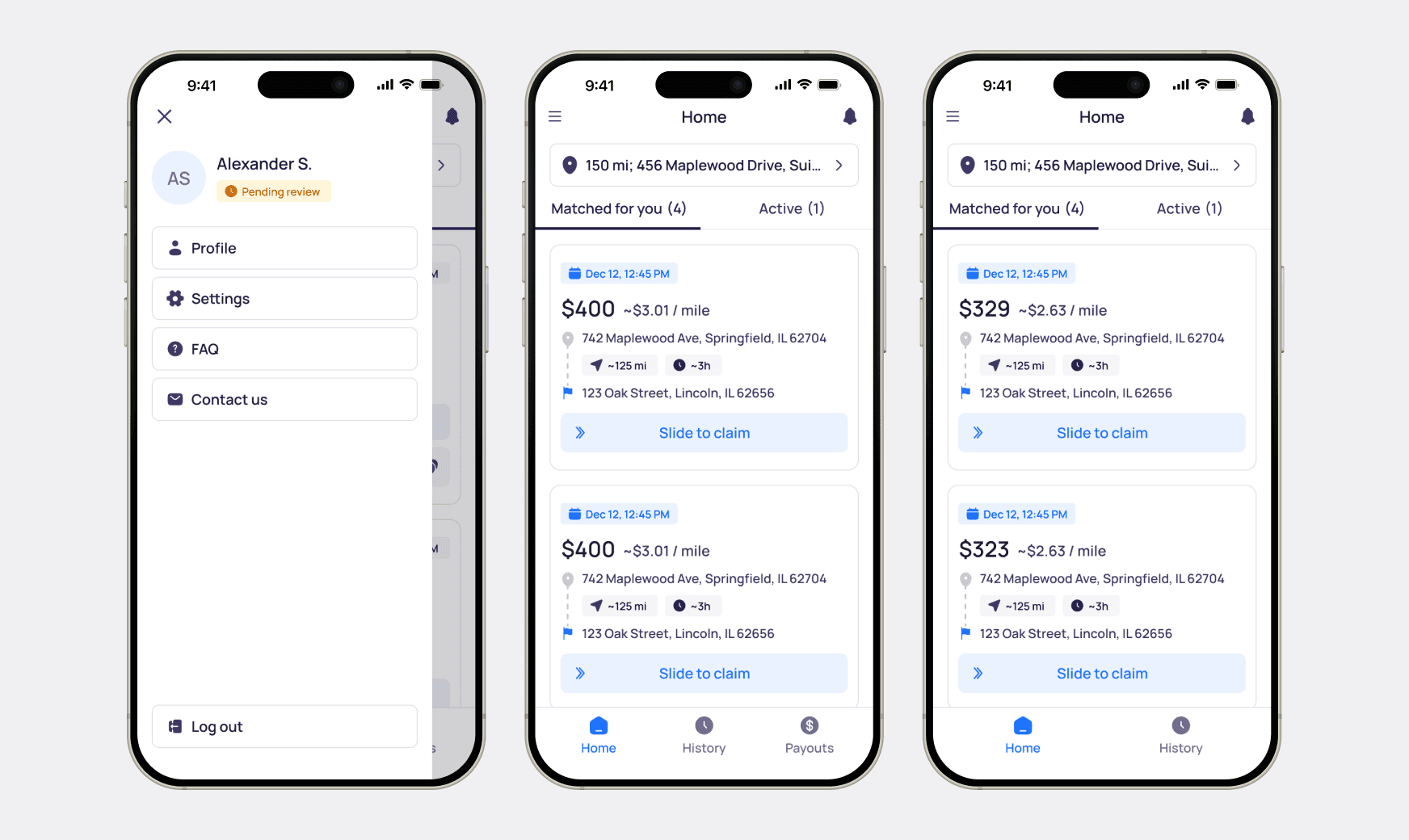
We reached a compromise: tab bar for primary navigation (loads, claims, payouts), burger menu for secondary items — profile, app settings, language switcher, support contacts, and legal. This decision shaped the entire IA of the app.
UI kit and consistency
The project had an existing UI kit started before I joined. I extended it throughout the project — adding new card components, missing states, and interaction variants needed for the Hauler flows. Working in parallel with another designer on separate applications created consistency challenges; design reviews were done separately by the lead. I flagged this and pushed for more joint reviews throughout.

Handoff
Dedicated sync sessions with developers and QA separately to walk through functionality, behaviour, and edge cases. All screens included annotated states. All scenarios covered in structured scenario format — nothing left ambiguous
Results
750+
screens & states delivered for Hauler app
26
User scenarios covered
5 mo
timeline, delivered on schedule
Navigation decision adopted — tab bar recommendation accepted by the client after a direct call; a structural decision that shaped the entire app architecture
Scope exceeded — delivered additional print-ready marketing materials outside the core design scope
Positive client feedback on delivery quality and process throughout the engagement